

Keep It Custom – User Experience
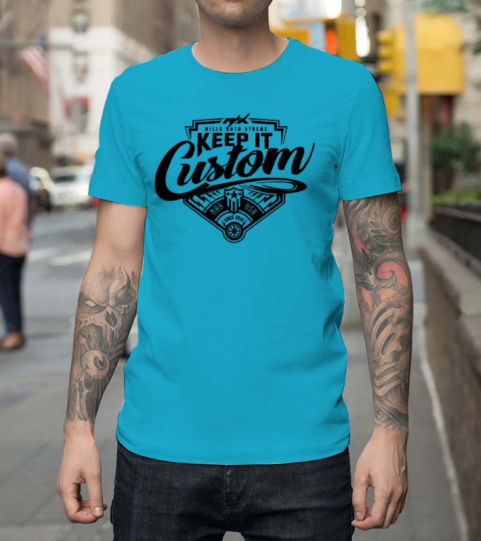
How can people who are wildly into vehicle and graphic customization show that off? Keep It Custom brand allows users to show off their love of customization by purchasing and wearing a t-shirt or other apparel/items.
Conversation with client
My first step was to have an in depth conversation with the client to discover as much as possible about the project. After getting an idea of how he sees this apparel website working and how he would like it to look, I asked him a series of questions to get as much information out of him as possible in order to design an experience that will work for his goals while at the same time working to meet his user’s goals. Here are my findings…
- Existing audience is made up of custom vehicle enthusiasts and vehicle graphics enthusiasts.
- Existing audience is making large purchases of complete vehicle wraps, parts for their custom projects, as well as small purchases along the same lines.
- Mills Auto is considering being a partner with Keep It Custom. Possibly co-branding with Keep It Custom and helping with promotion of brand.
- New users will be made by first launching the idea within the company he currently works at, Mills Auto. Mills Auto employees will all be notified of the new apparel line as Mills Auto will be backing the brand Keep It Custom with some support, which may include selling apparel at partnering Radco stores. New customers will also be made by word of mouth and handing out business cards at trade shows.
- There is no existing platform for sales. Everything will be made from scratch and managed internally for beginning stages.
- Knowledge of competition is minimal.
- Platform will start with desktop online store with ability to transform into mobile responsive experience easily.
Research
Because I am aiming at making the customers shopping experience as painless as possible, I decided to ask multiple people about their bad experiences shopping online. What things have frustrated them in the past? Where have they seen things done very well and very poorly when it comes to shopping online. Below is a list I collected from these conversations as well as some direct quotes.
“I like knowing what my total is going to be with shipping applied before I move to far into the checkout process.”
— Jesika, research subject
- Be able to contact the seller with any questions or problems with an order you already made.
- Allow you to see shipping cost at early stage in process.
- Have a ‘Quick View’ option that allows you to see the details of the item without going to a completely different page.
- Design an error page with helpful direction.
- Sizing - Both males and females complained about this. Is there a way to do a ‘Warby Parker’ model of this for apparel?
“If there are a lot of products, having a “view all” option instead of flipping through page after page. But not seeing more than 3 items per row, gives my brain time to see everything.”
— U of M employee, research subject
- Sure, shop by category (shirts, pants, hats etc.) but “view all”option. When I like a brand sometimes I don’t know what I’m looking for yet so it’s helpful to see everything at once I may find something I didn’t know I wanted or could search for.
- Avoid those stupid pop-ups that are supposed to alert us to sales/opportunities, but generally show up just where they are not needed (banners are so much better!)
“I hate it when I order an item from a new website and the order shows up with a problem that I’m not able to easily contact the seller about.”
— Dale, research subject
- Avoid poorly organized or inaccessible sorting features; such as low to high pricing, or new to old (ascending order).
- Avoid overly complicated B2B search/filter features to “narrow down” search. Generally these make it more complicated and get rid of items that would actually be applicable/interesting.
The information I was able to gather from users with frustration was very helpful when figuring out what to avoid and what to pay extra attention to further in the design of this project. It particularly helped form parameters for my next step, the competitive analysis.
Competitive Analysis
By this point I’ve had a conversation with my client where he has decided to start by just selling a limited amount of products. Because this is a completely new website and idea I decided to focus my Competitive Analysis on similar websites and companies and what they do well. Specifically, what they do well in terms of what the people I interviewed in the previous section were looking for. I looked at competitors websites and found ones that organized items well, called out shipping early and made their intention to sell items very clear. Above are websites I pulled design ideas from to solve my users problems.
Threadless, Betabrand, and Bonobos all have great and different ways to organize their products and also browse products. Bonobos has exactly what I was looking for in a Quick View option. Bonobos and Harley Davidson both call out shipping before you add the item to your cart. Hooters was a poor overall example, but a good example of a simple design with little items available to purchase. One more note is that Harley Davidson organized products based on when you would wear them.
All of the things that these companies did well were used in the near future when it came to constructing portions of the experience I’m designing.
Personas
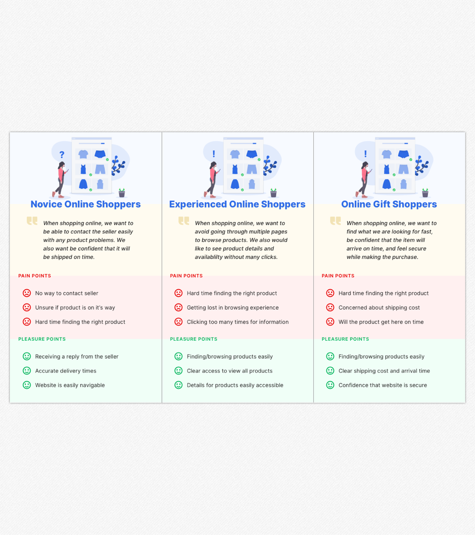
The personas here were determined initially by the conversation that the client and I had. After interviewing multiple people about their online experiences we were able to refine them further and even go back and ask specific types of shoppers more detailed questions about their online experiences. In the end we found the main three personas to focus on would be experienced online shoppers, inexperienced shoppers and strictly gift shoppers.
Breaking our users into categories allowed me to see pain and pleasure points of each and address their ability to fulfill their goals through my design choices.
At this point in the project I had found that many of the problems my users were having had solutions available that already existed. I noted those solutions. The one problem that I didn’t find an existing solution for in my research was finding out your shipping cost early on in the process. This is a solution I decided to build into my designs and test along with overall usability in my next few steps.
Site Map
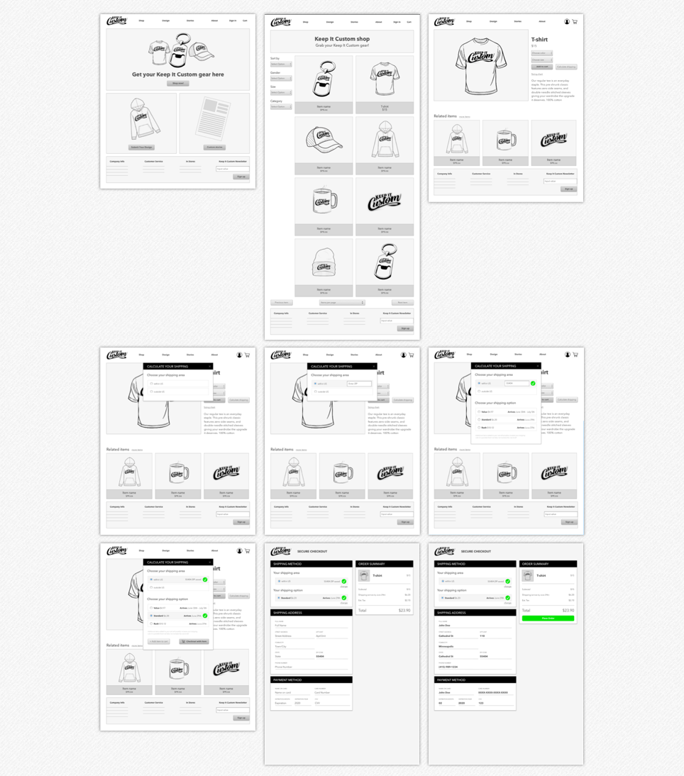
Included here is the portion of the site map that focuses on the flow for calculating shipping on an item. This will be the main focus of my user testing in the final phases of this project. Multiple other pieces of the website are tested, but the shipping calculator is the only portion that is completely new and the one thing that I have not run into before. For that reason I’m only including this part of the site map now.
I wanted the shipping to be calculated as soon as possible in the process and in as few steps as possible. Looking at this site map through the eyes of a person shopping for a gift allows you to see the particular speed they can get through the process. The user came to the site to buy one item in particular, they had never been there before and they want to see the shipping price up front so they can decide whether they want to continue or not.
Wireframes
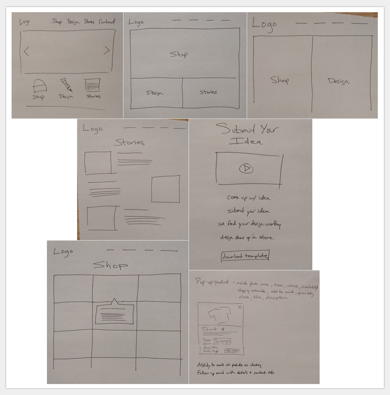
Wireframes started on paper for quick iterations and moved to Sketch designs for more pixel perfect representation.
The paper portion allowed me to layout ideas quickly and find a simple solution for the site that would allow the user to get from the homepage to the items quickly. Weighing how much emphasis to place on each portion of the website was much easier to determine with this rapid prototyping. After applying suggestions from interviewers and portions of other well done websites I moved from paper to making Sketch wireframes.
The Sketch wireframes go into more depth and detail. I’m able to layout the experience from reaching the homepage, finding the shop page, to finding an item the user is interested in. From there the user has the option to add the item to their cart or calculate the shipping before adding the item to their cart.
In this digital stage I also added pieces that were suggested my the people I interviewed. The user can easily sort items by categories or choose to view all items on one page. Within the item page a user can select the size and color of the item they want to purchase.
The shipping calculator is navigable in the prototype in the following section. There you can also see the other pieces I’m mentioning above in better detail.
Prototype
Here is a link to the interactive prototype:
Keep It Custom prototype
The goal with this interactive prototype was to take the Sketch wireframes above and show the interactive experience a user would have at the website.
This particular prototype is designed to test the experience of a user who wants to purchase a product, see the shipping cost as soon as possible, and checkout quickly and confidently.
Along your way through the experience you can also see the sorting options for viewing items and that there are options for choosing different sizes and colors. These portions are not interactive.
User Testing
User testing was by far the most interesting part of the process. I was able to test with three users and get some very great feedback on the overall design and experience.
All users were introduced to the experience in the same way.
First, I had them look at the homepage for 5 seconds and give me initial feedback on what they thought.
Next I had them explore the homepage themselves and have them talk out loud about what they were seeing and what they thought this website would do.
The next step involved me telling them that they where a user there to buy a product as a gift, to be interested in how much the overall cost would be, and complete the checkout. Along the way I would have them speak out loud as to what they were seeing and what they were doing. After the test I had them go back and look at the site and asked them to speak to anything else on the page they would like to.
Here are the findings…
“The keychain is making me think this is a promotional site.”
— User 1
One user initially thought the site was a promotional site because of the keychain that was front and center. Another thought it was a site where you could get your own designs screen printed on items. The third wasn’t sure exactly what Keep It Custom was, but assumed it was a company selling something.
“If ‘Keep It Custom’ were in a different font on the homepage I would have understood the intentions of the site better at first glance.”
— User 1
When I had the users go through the site to buy an item as a gift, two of the three noticed the ‘Calculate shipping’ button. One of them clicked on it assuming it would be the best next step. The third just tried to add the item to the cart and missed the button entirely.
“This website looks like a place where you can have your own designs screen printed on objects. I’d like to see previous examples of projects printed on objects to see how they turned out.”
— User 2
After the ‘Calculate shipping’ button was clicked on (because that is the only option in the restricted prototype) the users flowed through the rest of the process quite quickly. Though some of the prototype auto fills information, they felt that was all of the information they would need to fill in to complete the process and got to the end without trouble.
“This feels cozy. A place I’d like to be. I trust it.”
— User 3
When I had them go back through the site one noticed the sorting options and how they thought they would be very useful in a shopping experience. Others noticed them but didn’t elaborate. One user mentioned that it felt like a place they’d like to be, a place they would trust.
Overall I feel I received good feedback that I am still processing in order to make my next changes. When it comes to the homepage though, their reactions gave me some simple ideas to make the page feel more welcoming and to communicate it’s intentions more clearly.
Next Steps
Next steps involve applying user testing feedback to my designs, finishing other portions of the site, and continuing testing. At this point I haven’t moved into a final visual feel, so in my next round of user testing I will apply visual design to test, as well as mobile designs.
After further testing I will start to look into possible templates that could be used in the project development.
Update
The completion of this project has been put on hold. The friend of mine that started the project with me is no longer working at Mills and Mills owns a portion of this idea. Mills is choosing to not move forward with this idea at this time. However, if things change, this project may be completed in the future!
